Period Comparison Graph
Compare two (2) time periods for the selected location
Table of Contents
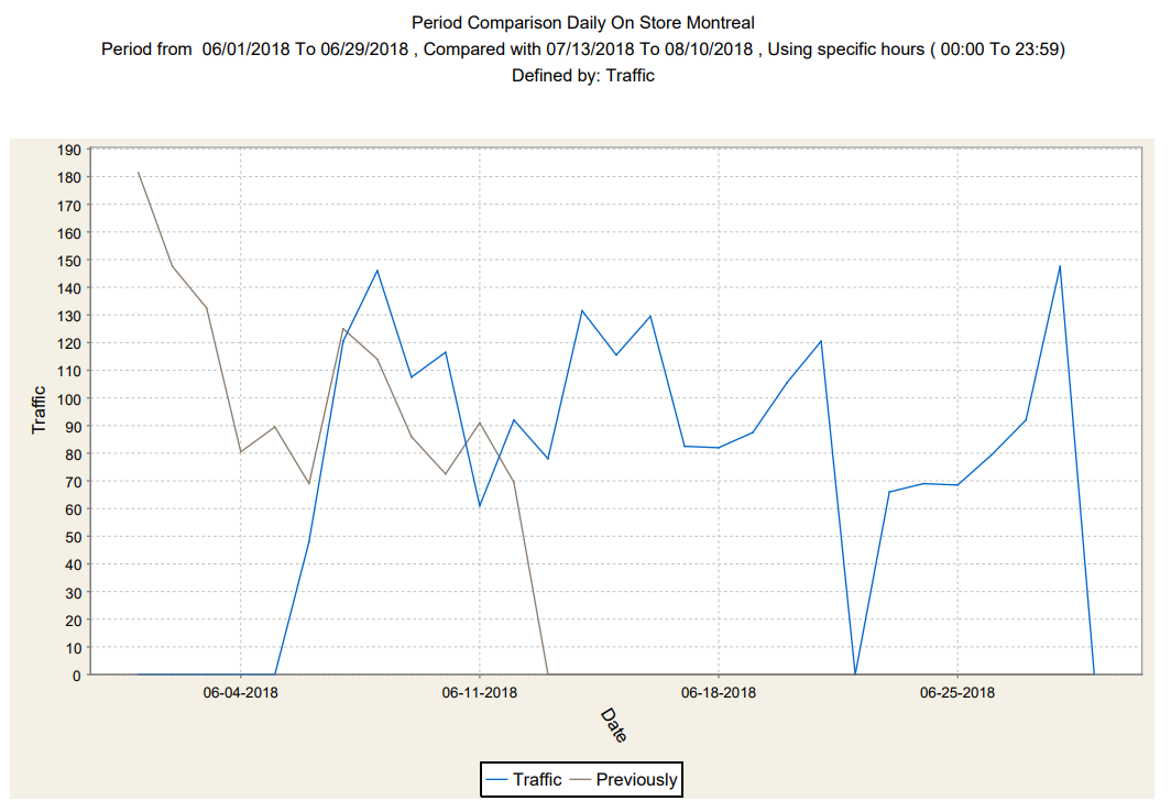
Overview
The comparison report is used to compare two time periods. The comparison report also displays the difference, the percentage change between the two periods and this week versus last week comparison.
How is it Useful?
Use it to compare two (2) periods of time for any location or groups of locations. Such comparisons can be used to track the source of increases/decreases between the two periods.
Who would normally use this report?
This report is recommended to anyone who wishes to compare any data type (traffic, sales, transactions,etc) to other similar period. (Ex: Same period last week, month or year.)
Steps:
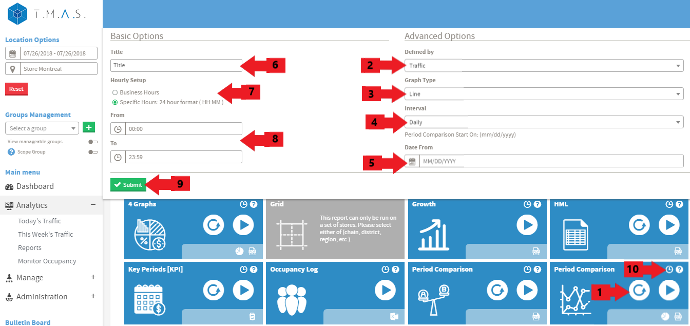
We assume that you have picked the location and date that you want to include in the reports.
- Select the Period Comparison Graph.
- Input the title name of your choice, this is optional;
- Click on Business hours or Specific Hours;
- If you selected Specific Hours, Input the desired value;
- Select the “Defined by” variable for the report;
- Select the Graph Type (Line, Bar or Area);
- Select the desired interval;
- Select the desired date to compare;;
- Click Submit;
- Click Schedule if you wish to have it automated (See Report Scheduling for more details);
Result: