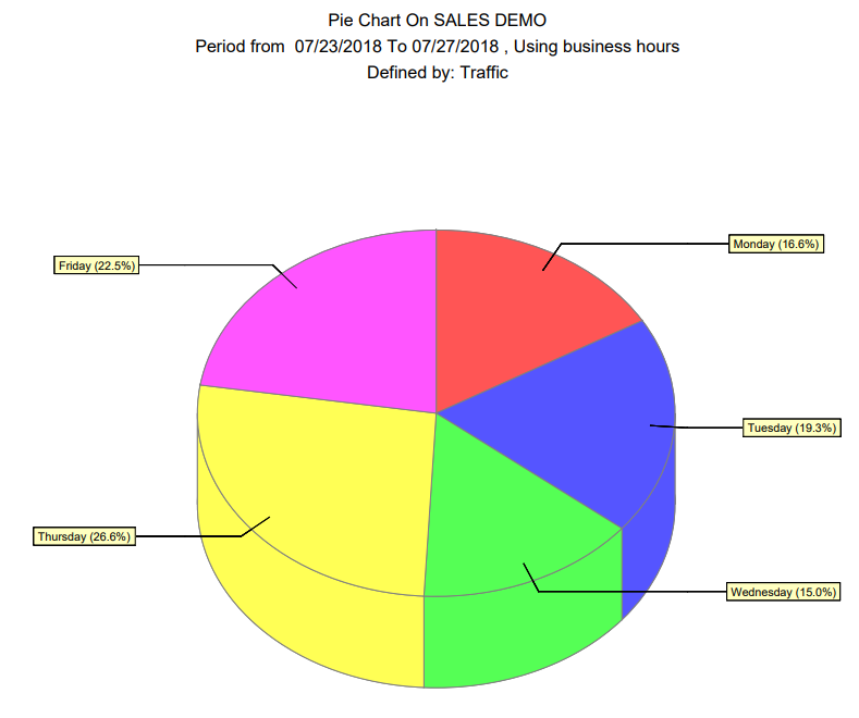
Pie Chart
Daily distribution in a simple well-known graphic!
Table of Contents
Overview
A simple Pie-Chart output which allows you to discover the percentage of traffic (or sales, transaction, staff) for each day, in relation to the week.
How is it Useful?
Simple but powerful, by selecting an extended range (4 weeks+) you can discover your typical weekly distribution of traffic. Since traffic flows (and buys) in predictable patterns, assuming the period you selected is typical, then once you know that Monday is on average 10% of your traffic, and Saturday 20%, you can forecast your traffic for the next Saturday.
Who would normally use this report?
Everyone
Steps:
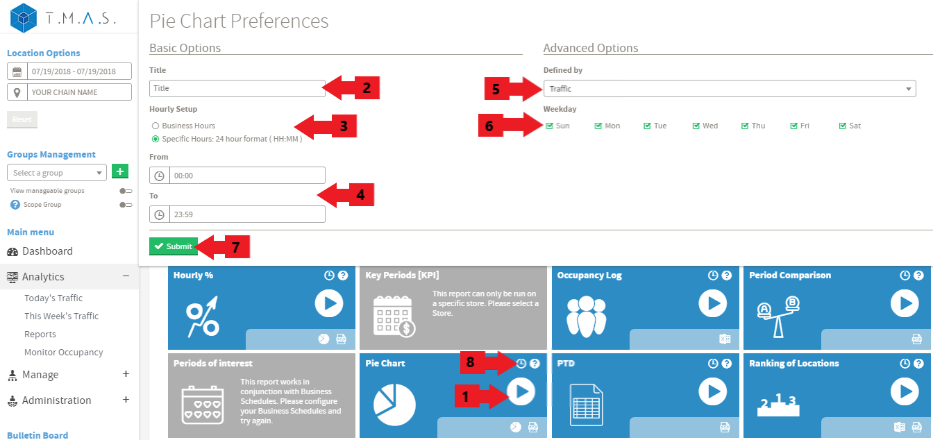
We assume that you have picked the location and date that you want to include in the reports.
- Select the Pie Chart Report.
- Input the title name of your choice, this is optional;
- Click on Business hours or Specific Hours;
- If you selected Specific Hours, Input the desired value;
- Select the “Defined by” variable for the report;
- Select the weekdays;
- Click Submit;
- Click Schedule if you wish to have it automated (See Report Scheduling for more details);
Result